Table Data
Display a tabular result set with filters, sorting, export, and pagination.
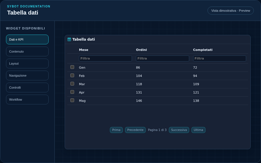
Recommended Configuration
- Associate a source, select visible measures, and optionally configure a hierarchy.
- Set the rows per page and verify the result set with the preview.
- Customize headers, column values, and table commands.
Configuration Options
| Area | Options |
|---|---|
| Data | Source, visible columns, labels, declarative renderer, and rows per page. |
| Table | Column filters, sorting, formats, export, and server-side pagination. |
| Selection | Disabled, single, or multiple; key fields, context name, persistence on refresh, and Drawer to open. |
| Identity | Title, Subtitle, header visibility, icon type, and action button. |
| Presentation | Standard, Compact, or Dense variant and message to display when no data is available. |
| Appearance | Background, background image, border, radius, padding, shadow, and typography for different areas. |
| Position | Coordinates and dimensions in grid cells on the page or container. |
Best Practices
- Filters and sorting are applied server-side to the entire result set.
astuce
Always verify the widget in Preview, in light and dark themes, and with a no-data state before publishing the View.