Sidebar
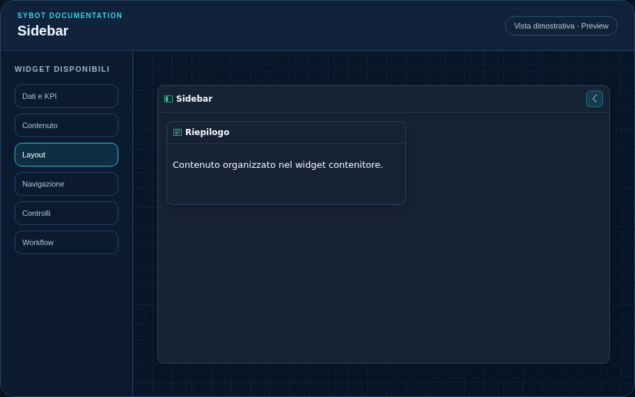
Create a collapsible side container anchored to the left or right.
Recommended configuration
- Choose the anchor side and the width in cells.
- Drag widgets into the Sidebar's internal grid.
- Set the initial open or closed state and verify space recovery in the canvas.
Configuration options
| Area | Options |
|---|---|
| Container | Child widgets, internal grid, and optional grid visibility in the published view. |
| Sidebar | Left or right side, initial state, and optional persistence. |
| Identity | Title, Subtitle, header visibility, icon type, and actions button. |
| Presentation | Standard, Compact, or Dense variant and message to show when no data is available. |
| Appearance | Background, background image, border, radius, padding, shadow, and typography for different areas. |
| Position | Coordinates and dimensions in cells within the page or container grid. |
Best practices
- Only one Sidebar is allowed per side of the page.
tip
Always verify the widget in Preview, in both light and dark themes, and with an empty data state before publishing the view.