Separator
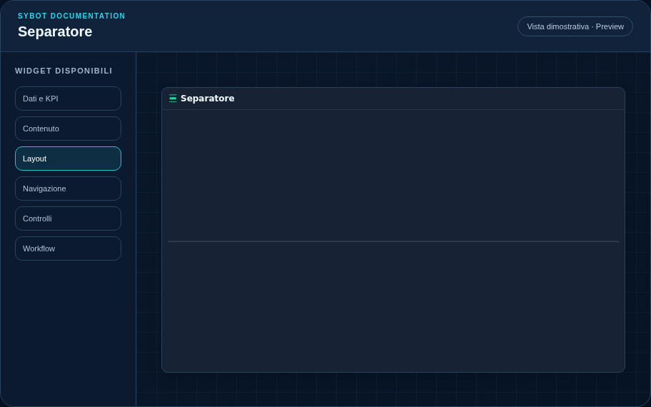
Creates space or a visual separation between widgets.
Recommended configuration
- Position the separator at the desired point.
- Adjust its width and height in cells.
- Configure colour, border and background if a visible line is required.
Configuration options
| Area | Options |
|---|---|
| Separator | Dimensions, background and border to create space or a visual line. |
| Identity | Title, Subtitle, header visibility, icon type and action button. |
| Presentation | Standard, Compact or Dense variant and message to display when no data is available. |
| Appearance | Background, background image, border, radius, padding, shadow and typography for different areas. |
| Position | Coordinates and dimensions in cells within the page or container grid. |
Best practices
- It can be reduced to a 1×1 cell.
tip
Always verify the widget in Preview, in both light and dark themes, and with an empty data state before publishing the view.