Drawer
Displays child widgets in an overlay panel controlled by context.
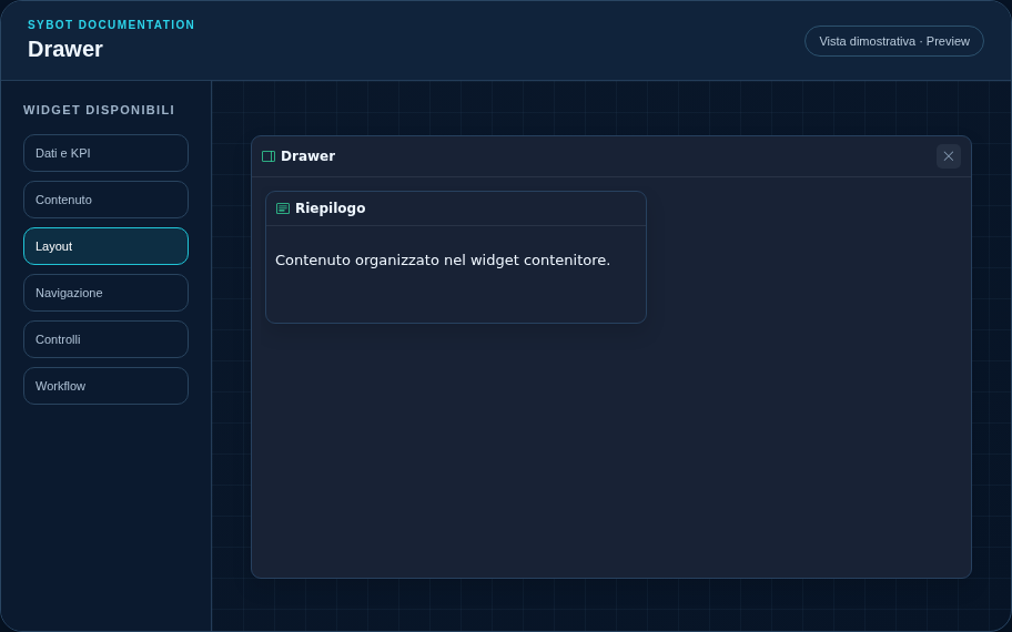
Recommended configuration
- Choose the side and context key for opening.
- Add detail or diagnostic widgets.
- Verify opening, closing, and keyboard navigation.
Configuration options
| Area | Options |
|---|---|
| Container | Child widgets, internal grid, and optional grid visibility in the published view. |
| Drawer | Side, context that determines opening, initial state, and closing by clicking outside. |
| Identity | Title, Subtitle, header visibility, type icon, and actions button. |
| Presentation | Standard, Compact, or Dense variant and message to show when no data is available. |
| Appearance | Background, background image, border, radius, padding, shadow, and typography for different areas. |
| Position | Coordinates and dimensions in cells within the page or container grid. |
Best practices
- The Drawer must not hide errors or confirmation requests.
tip
Always verify the widget in Preview, in both light and dark themes, and with an empty data state before publishing the View.