Line chart
Displays the trend of one or more series across ordered categories, often temporal.
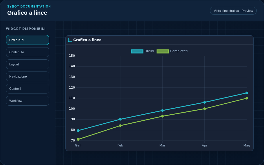
Recommended configuration
- Associate a data source saved from the Data and visualisation section.
- Choose a hierarchy or a category field and select only the measures to display.
- Configure formats, legend, series colours and chart style in the dedicated sections.
Configuration options
| Area | Options |
|---|---|
| Data | Data source, drill-down hierarchy or category field and measures to display. |
| Values | Format, decimals, locale, currency and dimension label format. |
| Chart | Legend, series colours, initial sort and direction. |
| Interaction | No action, filter, drill-down or drill-down with filter; target widgets and filter removal on second click. |
| Line and points | Thickness, broken or rounded line, shape and size of indicators. |
| Identity | Title, Subtitle, header visibility, type icon and actions button. |
| Presentation | Standard, Compact or Dense variant and message to show when no data is available. |
| Appearance | Background, background image, border, radius, padding, shadow and typography of different areas. |
| Position | Coordinates and dimensions in cells in the page or container grid. |
Best practices
- For Date range filters, use a column that is actually typed as a date.
tip
Always verify the widget in Preview, in both light and dark themes, and with an empty data state before publishing the View.