Grouped bars
Place multiple series side by side to compare them within each category.
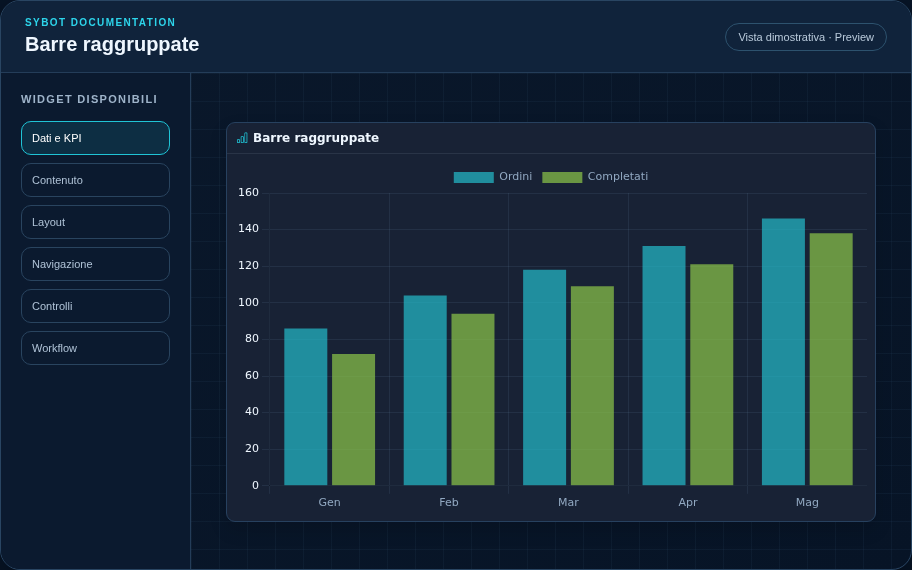
Recommended configuration
- Associate a saved data source from the Data and visualisation section.
- Choose a hierarchy or a category field and select only the measures to display.
- Configure formats, legend, series colours and chart style in the dedicated sections.
Configuration options
| Area | Options |
|---|---|
| Data | Data source, drill-down hierarchy or category field and measures to display. |
| Values | Format, decimals, locale, currency and dimension label format. |
| Chart | Legend, series colours, initial ordering and direction. |
| Interaction | No action, filter, drill-down or drill-down with filter; target widgets and removal of filter on second click. |
| Identity | Title, Subtitle, header visibility, type icon and actions button. |
| Presentation | Standard, Compact or Dense variant and message to show when no data is available. |
| Appearance | Background, background image, border, radius, padding, shadow and typography for different areas. |
| Position | Coordinates and dimensions in cells in the page or container grid. |
Best practices
- Provide at least one dimension and two value columns in the data source.
tip
Always verify the widget in Preview, in both light and dark themes and with an empty data state before publishing the View.