User View Visual Editor
The visual editor allows you to compose a view by dragging widgets onto a canvas. Changes are saved to the draft, and the save status is displayed in the top bar.
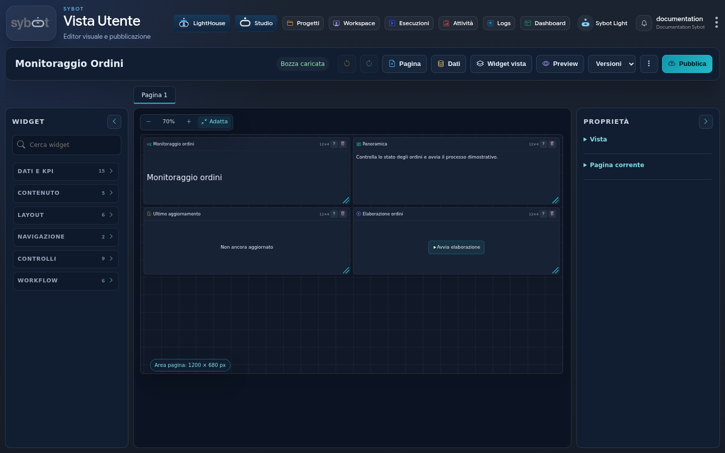
Toolbar
The main actions are:
- Undo and Redo;
- Page, to add a new page;
- Data, to manage sources;
- View widgets, to find and inspect already inserted widgets;
- Preview;
- selection and comparison of Versions;
- Publish.
Before closing the editor, wait for the status to confirm the save.
Pages
A view can contain multiple pages. The tabs above the canvas allow you to:
- select the current page;
- add a page;
- rename it;
- reorder it;
- delete it when it is no longer needed.
The Page navigator widget makes the same navigation available in the published view.
Canvas and grid
The canvas uses a 48-column grid to make positioning more precise. Views created with the previous 24-column grid are automatically updated without changing the visual footprint of the widgets. Drag a widget from the palette and drop it in the desired position.
Each widget can be:
- moved;
- resized;
- duplicated;
- deleted;
- configured via the Properties panel.
Zoom commands allow you to reduce or enlarge the canvas, restore 100%, or use Fit to show the entire available area.
For each page, you can configure width, height, automatic viewport adaptation, background, grid visibility, and data refresh policy.
The Data refresh option offers three modes:
- Only on initial view load, default: all pages and data are loaded on opening and are then reused during navigation;
- Also on every page open: returning to the page causes widgets to re-execute queries;
- Automatic while the page is displayed: the active page is updated at the configured interval, which cannot be less than 30 seconds.
Filters, drills, refresh commands, and updates required by Workflow actions continue to reload the affected data even in the default mode.
Widget palette
The palette is divided by families.
| Family | Examples |
|---|---|
| Data | Bar, line, area, pie, and donut charts; KPI; gauge; table; record detail; maps. |
| Content | Text, section title, image, safe HTML, and, if enabled, custom widgets. |
| Layout | Separator, panel, collapsible panel, sidebar, tabs, and drawer. |
| Navigation | Sybot link and page navigator. |
| Controls | Refresh, filters, active filters, reset, and widget visibility. |
| Workflow | Start, record actions, multiple actions, status, log, and Workflow console. |
| Diagnostics | View status, sources, and available operations. |
The Search widgets field filters the palette by name.
Reusable catalogs
The Custom widgets and Images buttons, above the search, open the shared catalogs. You can switch from the preview view to the detailed list, search for items, and select multiple items for import or export. The right-hand panel shows the owner, authorised users, and Views where the item is already used.
- a Viewer can use the item in a View that they can modify;
- an Editor can also overwrite the catalog item with a new revision;
- the Owner manages sharing and deletion.
Deletion summarises affected users and Views but does not remove already inserted copies: each View remains autonomous. For the same reason, modifying a local copy does not silently update the catalog. The owner manages access by searching for the individual user by name, username, or email and assigning them the Viewer or Editor grant; the panel does not load the entire user directory.
In the relevant editor, Promote to catalog makes a custom Widget reusable. Local images can be promoted from the Image Catalog of the View; selecting a shared image creates a local copy. In the image catalog, multiple files can be selected or dragged together. The preview of a custom Widget in the catalog is static when the component requires JavaScript or data: full execution occurs after insertion into the View.
View properties
The View section controls:
- description;
- light, dark, or system theme;
- font;
- density;
- spacing;
- availability of advanced filters in the runtime.
The properties of the selected widget depend on its type and include content, data source, formats, style, behaviour, and interactions.
For Category filter, you can separately choose the input mode and single or multiple selection. For widgets that trigger Workflows, the Interactions section shows the non-file parameters of the selected Workflow: each parameter can use the Workflow default, a default saved in the widget, or an fx formula. The dedicated option determines whether the parameters panel must appear before launch and in the preview.
For line and area charts, Data and display also includes the dedicated group for line appearance. You can choose the thickness, size, and shape of the point indicator — none, dot, diamond, triangle, vertical line, or X — and use a Stepped or Smoothed line. Settings apply to all series of the widget, while colour remains configurable per individual series.
Containers
Panels, sidebars, tabs, and drawers can contain other widgets.
- Panel: groups elements with an internal grid.
- Collapsible panel: can be opened or closed by the user and uses the full height assigned to the widget, leaving available space under the header for the content.
- Sidebar: anchors to the left or right and can start closed.
- Tabs: divide widgets into local views within the same container.
- Drawer: displays information in an overlay panel, often in response to a selection.
The View widget panel helps locate nested widgets and control their visibility in design and runtime without removing them. Each item uses the same icon with which the widget type is identified in the palette; indentation and lines instead show the relationship between containers and children.
Style and formatting
Each widget can inherit the view style or use specific settings for:
- colours and typography;
- background and border;
- spacing and alignment;
- shadow and corner radius;
- header and icon;
- number, date, and currency format; locale and currency are chosen from supported value lists and use
it-ITand EUR as default values respectively.
Conditional formatting applies a style when a data rule evaluates to true. Conditions are evaluated in the order shown, and the first satisfied one takes precedence.
Dynamic visibility shows a widget only when the configured formula returns true. The rule applied to a container also involves its children.
HTML and custom widgets
The Safe HTML widget accepts controlled HTML content; disallowed elements are removed.
The Custom widget, when enabled by the administrator, uses a separate editor for HTML, CSS, JavaScript, fallback PDF, and isolated preview. Code is executed in an isolated area and can interact with the view only through functions made available by the editor.
When the widget uses a Data source, the initial context passed to the code already contains the first result set both in preview and in the published view. Subsequent variations are communicated as context updates.
Do not include credentials or sensitive information in the code: published content can be viewed by the browser.
Catalog import and export
Both catalogs support multiple selection and produce importable JSON packages. In the presence of an existing element, import proposes reuse, overwrite when authorised, duplication with a new name, or exclusion.
Exporting a View also proposes custom widgets and images as optional dependencies. During View import, Sybot displays the included dependencies and allows you to apply the desired policy to each. When a duplicate is created, references are automatically updated. Copies already embedded in the View remain available even if the corresponding catalog dependency is ignored.
Best practices
- design the information hierarchy first;
- limit the number of simultaneous charts;
- use titles and messages that are understandable without data;
- always verify both light and dark themes;
- test layouts, filters, and containers in Preview;
- use the Diagnostics widget in a dedicated area when the view combines many sources or Workflows.